
UI Customization Options
V.1
For the standard out-of-the-box UI, authID offers the following customization options:
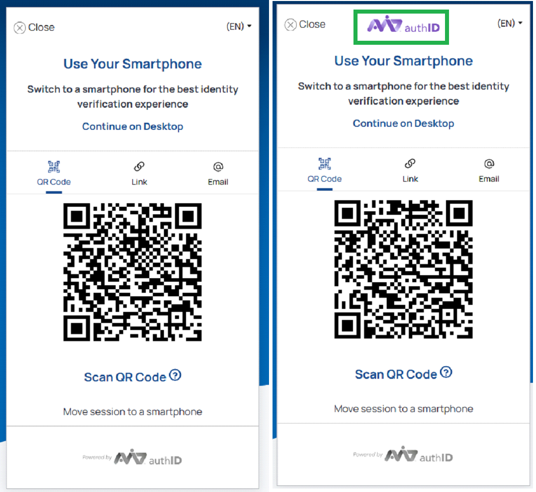
logo
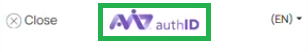
Allows displaying a custom logo in the header. By default, the authID logo is displayed.
Default logo enabled:
"header": {
	"hide": false,
	"logo": ""
},
Default logo enabled.
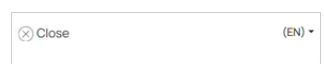
Logo disabled:
"header": {
	"hide": true,
	"logo": "https://yourdomain.com/logo.svg"
},
Logo disabled.
header
Allows enabling or disabling the entire header.
Header enabled:
"theme": {
	"header": true,
   },
Header disabled:
"theme": {
	"header": false,
}, 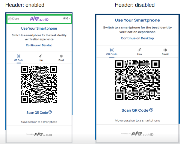
Header enabled / disabled.
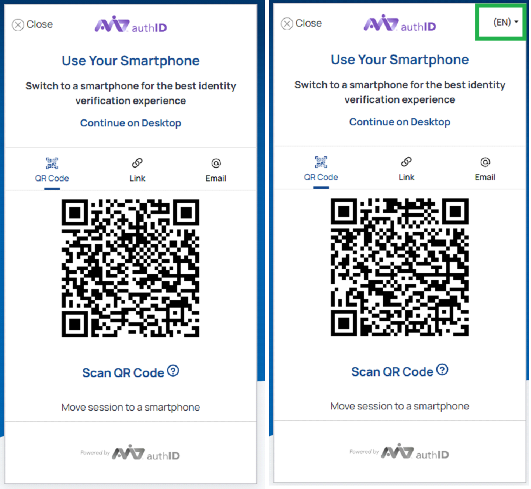
headerLeft
Allows enabling or disabling the controls on the left side of the header.
Left control in the header disabled:
"theme": {
	"headerLeft": true,
   },
Left control in the header disabled:
"theme": {
	"headerLeft": false,
}, 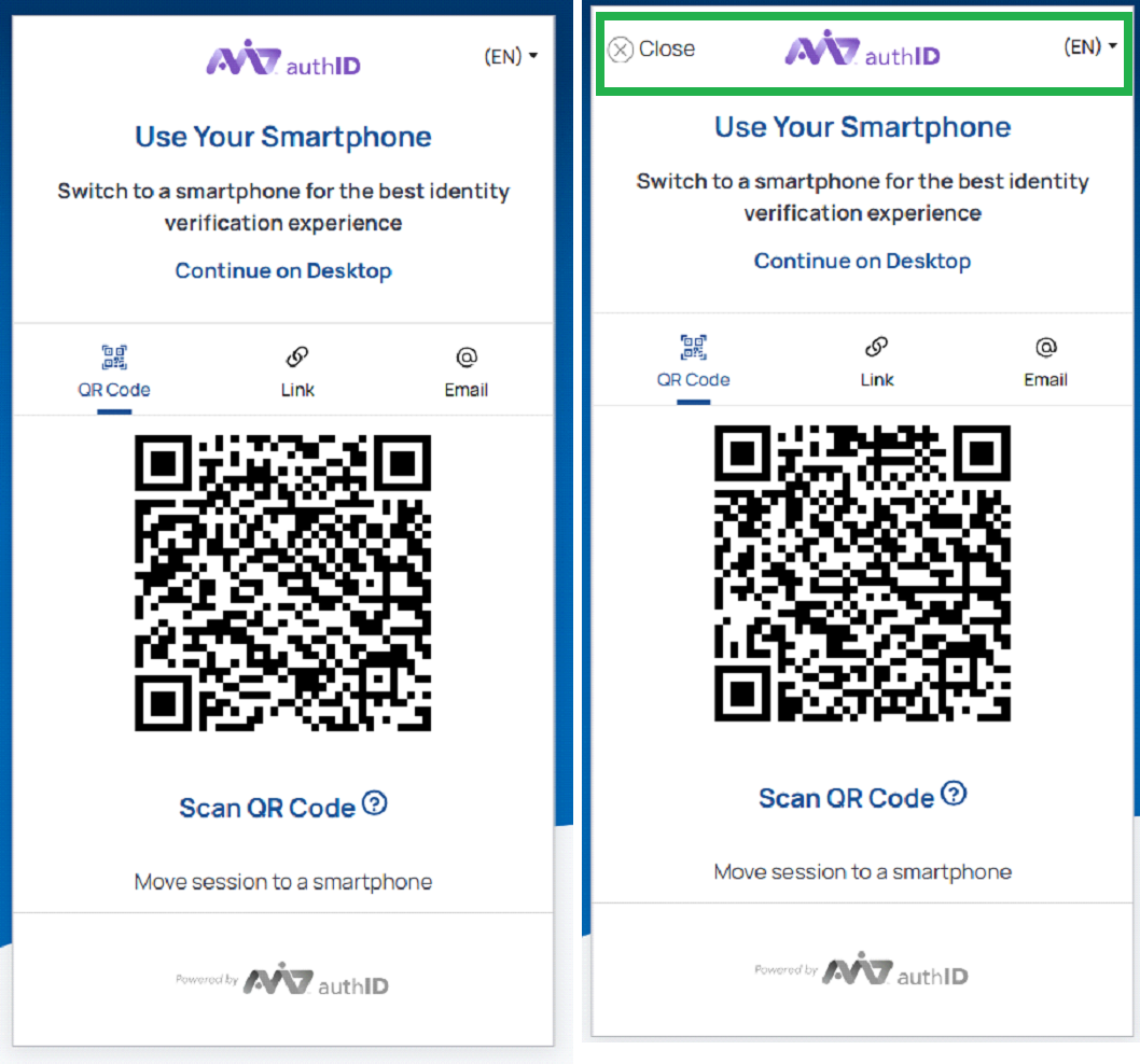
Left control enabled / disabled.
headerExit
Allows enabling or disabling the Close control on the left side of the header. The Back control remains available.
Close control enabled:
"theme": {
	"headerExit": true,
   },
Close control disabled:
"theme": {
	"headerExit": false,
}, 
Header - close control enabled / disabled.
headerCenter
Allows enabling or disabling the center section of the header.
Header center enabled:
"theme": {
	"headerCenter": true,
   },
Header center disabled:
"theme": {
	"headerCenter": false,
}, 
Center enabled / disabled.
headerRight
Allows enabling or disabling the controls on the right side of the header.
Right control in the header enabled:
"theme": {
	"headerRight": true,
   },
Right control in the header disabled:
"theme": {
	"headerRight": false,
}, 
Right control enabled / disabled.
footer.hide
Allows enabling or disabling the 'Powered By' footer logo.
Footer logo enabled:
"footer": {
		"hide": false,
		"hideLogo": false,
},
Footer logo enabled / disabled.
Progress
Allows enabling or disabling the progress bars displayed at the top during document scanning and selfie capture screens.
Progress bars enabled:
"theme": {
	"progress": true,
}, 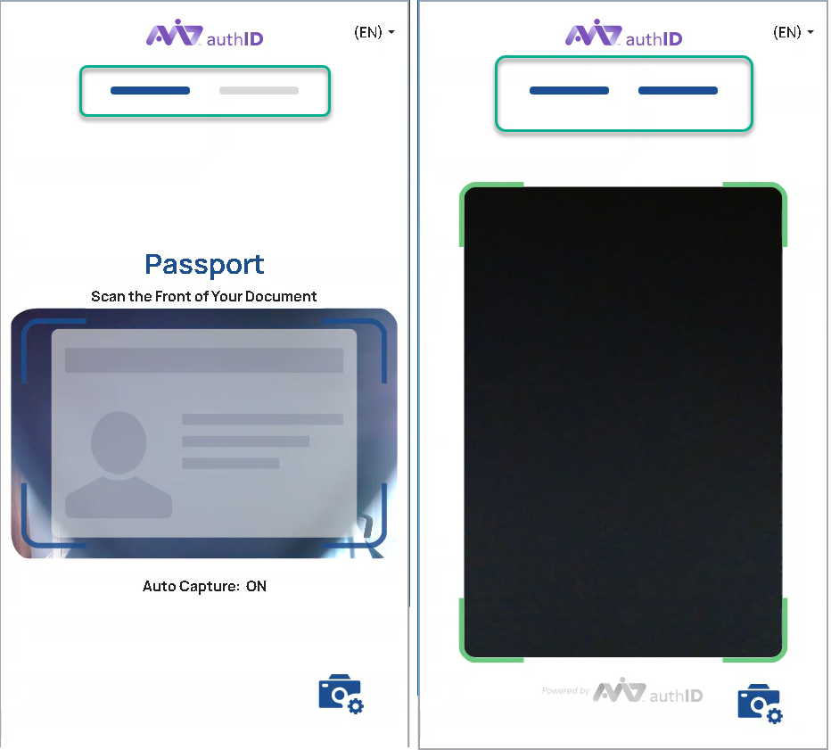
Progress bars enabled.
Progress bars disabled:
"theme": {
	"progress": false,
}, 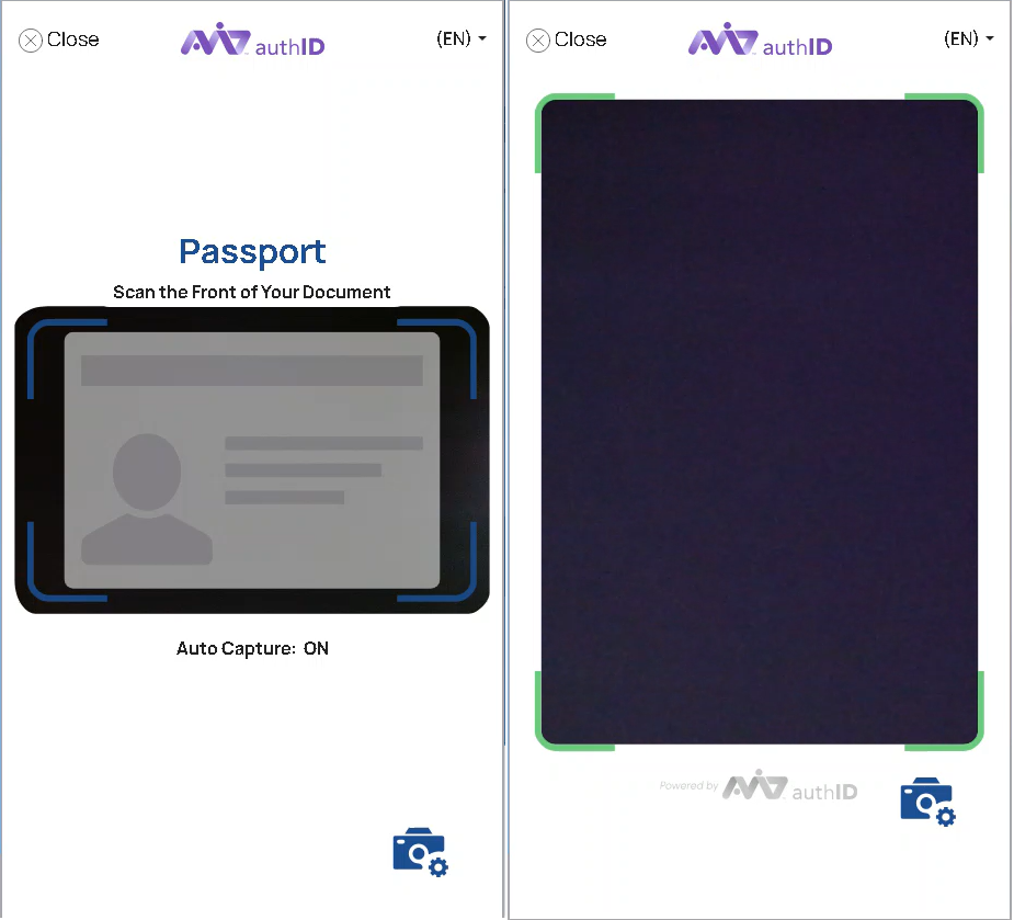
Progress bars disabled.
Updated 8 months ago